

Top 0.4% reviewer
Only 4 users have written more helpful reviews.
Top 3 texture pack
Hugues Ross has a texture pack placed at #3.
>50k downloads
Has received 62946 downloads across all packages.
Packages
-
Cartographer
A mapmaking API. Needs additional mods to function.
-

Cartographer for Minetest Game
Adds regional maps that you can craft and place (Minetest Game version)
-
Cartographer for Repixture
Adds regional maps that you can craft and place (Repixture version)
-
Fly-B-Gone!
Hides butterflies/fireflies
-
Mtg Craft Reverser
Makes crafting recipes in Minetest Game reversible
-
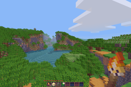
RPG16
A simple texturepack reminiscent of classic RPGs
A visual nightmare
After loading up Dreambuilder and playing with it for a while, I'm begining to question how useful this could possibly be for builders. The UX of the inventory is a mixed bag, while item access is improved with buttons and categorization there are some truly confounding decisions... like making the category list longer than the size it can fit in, requiring the user to click buttons to scroll it back and forth. It's also notable that the creative inventory takes up less than half of the space alloted for the UI in the first place, the default inventory and hotbar widths don't line up properly, and the hotbar slots aren't even properly marked in the inventory (have fun counting those by hand).
But enough about that. This is intended as a tool for builders, so lets look at the real meat: the visuals. Dreambuilder takes the interesting stance of mixing numerous texture and model styles instead of offering a consistent look, ensuring that only a subset of its massive item list can actually be used in any given building. Moreover, even with the author's HDX texture pack (mentioned on this page) the problems persist! Even the natural materials that spawn in the world lack visual consistency, often changing both in artstyle and texture density.
And then there are the loading times, which are bad enough that the author decided to warn users about them in the description. With a modern gaming PC armed with a fast SSD, loading an empty world takes "only" 30 seconds.
In summary--this is a tool for artists with numerous conflicting visual styles, poorly-designed and inefficient UI, and godawful loading times, that also expects a high-spec machine to run. All of these factors are going to make the process of building slower and more difficult, and just for good measure the latter ones will also make the resulting builds harder for regular users to view! You're better off with pretty much anything else.
Unique and well-polished, but not for everyone
I think it's safe to say that NodeCore is the best game I've played in Minetest, hands-down. The game features a lot of polish and accessibility features that I haven't seen elsewhere, and since I last played the dev has clearly put a lot of effort into making the game control in a smooth and convenient fashion.
The design of the game is also quite unique, by making every craft and interaction occur in the world itself rather than an inventory screen and often involving the interaction of natural forces and materials. This makes many normally-trivial things harder, but also gives the player an incredible skill ceiling, with all kinds of optimization and automation becoming possible as the game progresses. But it's never as simple as getting the "does thing X but faster" block--the player must design their machines using the environment. It's one hell of a concept, and I caught myself a few times spending a lot of effort trying to puzzle out faster ways of doing what I could already do because doing so is genuinely useful and engaging.
On the other hand, I suspect it's this very concept that makes me less interested in playing. When I play games, it's usually to unwind and not have to do serious thinking about design and interactions (my job offers plenty of that, thanks). As such, as much as I admire NodeCore and can tell that it's good, it's also a game that's never held me for very long. It also doesn't help that progression is at times tied to guesswork, having to work out how a new object works by brandishing various nouns and verbs at it can be tiring even if you know it'll let you do something cool in the end.
Regardless, if you haven't given the game a try I really implore you to do so. You won't find another game like it, and the quality is apparent. For those who enjoy what the game has to offer, NodeCore is a veritable feast.
Good Bones, but Needs Some Love
I'll be honest--I'm lazy, and I usually don't enjoy more 'realistic' or 'hardcore' sandbox games as a result. However, I was pleasantly surprised by this game. While it is lacking in some areas, it has a lot of neat ideas and I found a lot of fun in it.
In general, The RealTest Game takes the few activities present in Minetest Game and adds greater complexity to them. In many cases, this works rather well. To give a good point of comparison, one needs only look at metalworking. In MTG, digging deep enough to find any ore is the entire "challenge". On the other hand, ore is plentiful and rather easy to find in RTG... but you need clay for vessels to cast the metal, lots of charcoal to smelt down the metal, a strong anvil to work the metal on... Instead of spending half an hour digging a staircase, you spend half an hour planning, exploring the world, and gathering supplies. It makes an otherwise boring game much more interesting.
Sadly, the game is not without its weak points. With no dangers, hunger, or other external forces, there's not really much to push the player forward aside from curiosity about the game. There are awards, which in a better game (NodeCore) could act as hints/goals for the player... but for some reason, there's no easily-accessible UI for them. Seems like an oversight. I also really don't like how the game forces you to manually click on items to grab them, yet has no problem magnet-ing them over to you. And then of course there's the fact that you can 'chop down' a tree by just breaking the block under it with your fist. This is not a game without flaws.
And sadly, those flaws are likely to remain. This game is not actively developed, though I think if it were it could be an honest contender for the top of CDB. I see this as a good opportunity for any enterprising modder looking for a project to jump on, and a few fun hours of discovery for a normal player.
Moving in the right direction, but...
I previously reviewed WhyNot? several years ago. Surprisingly, the developers responded to my feedback, and I'm happy to report that some of my complaints have been resolved.
Which is why it's hard for me say this: I still don't think I'd recommend the game to new players.
WhyNot?'s early game suffers heavily from the baggage Minetest Game brings with it: Heavy elements of RNG due to the biome-specific resources, numerous empty caves, and deep ores lacking interesting content between you and them. This leads to an awkward feeling where the game takes off quickly with its early guidance, then the pacing hits a wall as you slowly gather materials and try to find a cave that doesn't end immediately. After around 2 1/2 hours, I found myself still stuck with stone tools and without having made a meaningful step forward in progression since the 30 minute mark. Someone with more skill or dedication might've gotten to the good stuff, but frankly I found the early game too slow and boring to continue with.
Having said this, it's not an impossible barrier to overcome. I believe the folks behind this game can improve it in time: they've shown the willingness and ability to fix issues in the past, and I wish them the best of luck.
There's a longer video showing my impressions here, and an accompanying blog post here. Viewers may find the additional context useful when deciding whether to heed my words.
The Best Bad Game I've Played In a Rather Long While
XaEnvironment is not a good game. It's janky, doesn't do a good job explaining its mechanics, doesn't look good, doesn't sound good... and yet, I've had a blast playing it. It's the kind of bad that comes off as earnest and endearing, rather awful or lazy.
I've only played the game for about half an hour, but in that time I:
Even dying horribly is a genuinely interesting experience in this game!
I feel like I should still point out some of the bad parts of this game in the interest of giving the dev actionable feedback. The biggest problem that I see right now is that most interfaces are really cluttered and poorly designed, including some particularly annoying behaviors (eg. pressing enter in the search field closes the craftguide instead of searching). Additionally, while it's neat to see animals and npcs all over the place the volume of sound effects feel really out of wack. It's hard to describe, but it feels like everything is next to you even if it's rather far away. Finally, more feedback and polish on the parkour would be really helpful. You have a neat system, but it can still feel pretty unclear and disorienting at times.
Even in its current state, the game has enough novel stuff to be worth a look. It's fun.
Interesting concept, poor execution
Personally, I quite enjoy the trend of simple puzzle games being ported over to Minetest. I think it's a breath of fresh air in a landscape otherwise dominated by the survival-crafting genre. With that said, this version of sudoku is not particularly good.
The problems start at the hotbar. The game represents numbers as physical items, but displays 9 items over of 8 item slots. With none of the items lining up with their slots, keeping track of your selection becomes notably harder than it ought to be.
Due to the vertical presentation of the board, the upper rows are difficult to see or access from the ground. Thus, the player needs to enter flying mode if they want a good shot at completing the puzzle. Rather than enhancing the game or putting a twist on it, the 3rd dimension here only serves to make solving puzzles more of a hassle.
The game has checks to prevent illegal moves, but doesn't have any automatic check to see if you've completed the puzzle. Instead, you must fly over to the block labelled "FINISCH" and punch it. Rather than advancing levels, it then requires you to go back to the level selection blocks, punch the relevant one, and click on the next level. The game doesn't bother telling you which levels are completed either, though it's not hard to guess since they unlock sequentially.
The game suffers from a general lack of polish. Whereas most 'minigames' use the player's inventory as a level menu, this game leaves in the standard Minetest Game menu complete with a crafting grid and craftguide listing every recipe from MTG... There's barely any feedback to moves, and no way to place potential numbers like most Sudoku games do either. The whole thing has serious "barebones proof-of-concept" vibes to it despite having been released 4 years ago and still receiving updates to this day.
I don't think it's impossible to make a puzzle like Sudoku work in Minetest, but this clearly needs more design and development work to be good.
How on earth did this take 8 years to make?
According to the in-game guide, this game was made over the course of 8 years. To be perfectly frank, it looks more like 8 weeks of work at best.
Combat barely functions. Mobs appear to be identical reskins of the same model, are incapable of moving slightly to the side to get around an obstacle, and cease to do damage if the player puts on any piece of armor. A pair of wooden clogs is all it takes to foil these beasts, who will queue up ~2m from the player and respectfully wait to be slain. That is, unless they come in contact with any water which will melt them in seconds. Just to be sure that this wasn't just an early-game thing, I turned on noclip and flew to Y -1,750. The mobs there were no different.
The game's UI is a sprawling mess of menus, full of typos and broken english. I assume english is not the dev's first language, but it makes some sections (such as the guide explaining how the game works) mostly-unintelligible. Of course, none of that excuses the poor layout and UX, which often requires twice as much clicking to do anything as similar games.
The game seems to revolve upgrading a 'battleaxe', which is every tool from MTG combined, indestructible, and better than them in every way. And yet, those tools still exist to clog up the craftguide for no reason...
I could keep going, there's plenty more to say but... the dev clearly doesn't care about the quality of their game, and I'm finding it hard to care about the quality of my review. I think I've given enough examples to make my point.
Hard to Recommend
I feel bad voting this down, since (going by the author's response to another review) it accomplishes everything it sets out to do--it's a simple game where you dig blocks, with a joke about crypto. In a sense, you could call this an interactive art exhibit. It has a message of sorts, and relays it to the viewer through its mechanics. And so, it functions as intended.
However, as a reviewer I try to use my reviews as recommendations to new players. So I have to answer the question of "Is this worth playing?"
In this case, I feel like the answer is no. Since all materials use the same grainy noise texture with different colors, it's rather difficult to use this as a canvas for building. The rarity of most variants-which is very point of the game-makes this even harder. And so, we're really just left with a big ol' pile of brown to dig into. The simple activity of digging is so engrained in Minetest that you can do it in pretty much any game if that's what you're after, so so Mining Game doesn't really bring anything to the table.
Media is subjective, but I think the most engaging way for a piece to deliver a message is by drawing in and engaging the viewer, then capitalizing on that engagement to say something. This game doesn't really do that, and doesn't really offer anything else either.
Simple concept, strong execution
Much like with Box World 3D, I don't really feel the need to describe the game because I suspect everyone here has seen a maze before. And indeed, this game provides mazes just as promised!
The game has some nice touches, such as providing a soundtrack (with per-theme tracks even!) and some custom UI for picking mazes/restarting if you get stuck. I didn't see any bugs while playing, and what's there is relatively well-polished. Some of the themes also have neat visual touches, like the fake reflections and particles of the club theme or the fact that the glass theme is a hell that will haunt my nightmares tonight :)
If there's one clear improvement I'd like to see eventually, it'd be a proper 3rd-person mode where you look down at the maze. Switching camera modes kinda works, but it's a very janky and disorienting experience due to the camera clipping and lack of player model. Having a more polished custom solution would be really neat, and I think it would help add more replay value to this otherwise short experience.
This is not a game I expect anyone to sink hours into, but it's a nice way to spend 15min and it speaks to the presentation possible in more restrictive Minetest experiences. Good job.
It's a start
I played this game for an hour, and I'll say this--the game is better than the cursed Sam on the icon may imply. It falls into the Minetest game genre of "mod soup", games that take MTG and load existing mods over it in the hope of turning it into a real game. And as far as soup goes, this one's not too bad. Runs has replaced the default textures, and a number of non-default textures, with new ones that match up well enough. He's even added some chill music to the game, which I can certainly get behind!
Unfortunately, this is not enough for me to recommend the game in its current state. The problems start with the inventory. I'm aware that this comes from the
unified_inventorymod, but you chose to put it in, it doesn't fit the game's aesthetic at all, and the UX is pretty awful... there are over 1500 recipes to dig through from the start, and all you have to help you is a searchbar. This makes it hard to see what you can actually do with the items you find, and is extra disappointing when you discover that the new ore you found has no use.The game has mobs. I can confirm this, because in the full hour that I played I encountered exactly 2 of them. Like the inventory, they also don't fit the look at all. But since they're functionally nonexistent, ¯\(ツ)/¯. The game also has a hunger meter (that drains so slowly it may as well not matter) and a... row of water droplets? Maybe? That meter did nothing during the hour that I played, I have no idea if it's bugged or just useless. The game also popped up some errors about
secure.trusted_modsat launch... a pair of error messages about security is not the best first impression for new players.In short, I think the game's got some variety and basic aesthetic down but the actual gameplay is lacking. You've successfully put lipstick on the pig that is MTG, which is better than some folks! But it's still a pig, and with all the annoyances I just don't see anything compelling me to keep playing.
Short and Sweet
If you are familiar with Sokoban (and who isn't, at this point?), you should know what to expect here. Seeing it done in 3D with Minetest is a novel concept, and as short as the game was I genuinely enjoyed my time with it. Be warned--with 7 levels, the game is only 5-10min in length. If this game cost money, I wouldn't be happy with my purchase... but luckily it's free, so I can wholeheartedly recommend it to anyone who's bored on their lunch break!
With that said, I'd be remiss to ignore the places where the game could improve. First is level count, but more importantly level quality. There are 7 levels, but I think levels 5 and 7 are the only ones that really require the player to really stop and think to solve them. Granted, it's important to have simple introductory levels, but having only two "proper" puzzles is unfortunate.
I'd also say that while the graphics are nice, the game feels generally unpolished. There's absolutely no audio, no effects or feedback aside from boxes turning red, and the player jerks to a halt on every 'tile' even when the movement buttons are held. And when the final level ends, it just restarts with barely any acknowledgement that you beat it. These might not seem huge, but I believe that making a game feel good to play is almost as important as making it function in the first place.
I think this alright game could grow into a really great game if it's given more development time, and I hope it receives that time.
Inspiring! However...
Let's start with the good, as Drift Game has a lot going for it. The lo-fi aesthetic is pretty, the concept is unique, and I enjoyed being able to drive around on procedural roads. This feels like it could be expanded into a really cool open-world driving sim making full use of Minetest's mapgen. Heck, if I weren't too busy I'd fork this and make it myself!
So, as a tech demo for the 'driftcar' mod I think it succeeds. I played it, the car was neat, I wanted to do something with it. However, ContentDB is a place for users to find content to play and I write reviews with them in mind. On that front, I think this game fares poorly.
Let's start with the car. Put simply, the 'drifcar' handles like it's driving on ice, even when it inevitably slips off the road. If you run into a tree (you will run into many), your screen will turn completely black as you try to navigate out of the mess you've gotten yourself into. Also, I tried reloading my world and had to chase my car as it drove off without me...
The next mark against this game is a lack of variety. The world is a sheer flat plain of grass and pavement (the car has no slope-handling functionality, I presume), dotted with pine trees. The trees are a nice touch but they're not enough. You could imagine that with snowy fields, deserts, oceanside routes, etc. the game would be more interesting to play. Really, just dropping this game into the average MTG mapgenv7 map would likely be enough to last a while. Unfortunately, that's not what we have today.
I should also mention perf. It's hard to say if this was the game's fault or the engine's, but at high speeds you can feel some lag spikes and stuttering that hurt the game's playability. It's not a persistent issue, but it's there.
So in the end, I walk away with both excitement at the possibility, but disappointment at the reality. This is worth poking if you're a dev looking for a project, but if you're a player I see no reason to touch this one.
What's the point?
There's no indication on the page that this game is a work in progress, but it seems to be incomplete to such a degree that there's no real point for folks to play it.
I got through a bunch of crafting recipes and couldn't really find anything interesting to do in the game aside from putting items in various shapes on the crafting grid. To make sure I wasn't missing anything I checked the code, and indeed--there are:
That's all there is. It's a collection of convoluted crafting recipes that goes nowhere. It's not even good for building, since most blocks require multiple stages of crafting and a fair amount of resources to produce.
The game might be good someday. It might be a game someday! But today, I don't see any reason to interact with it.
A must-have for development
I've done some light schematic building lately, and this mod is by far the easiest and most effective method I've found. It's simple and convenient to use, completely mod/game agnostic (a must for development outside of MTG), and offers reasonably polished presentation.
The only features that feel like they're missing is an option to load schematics registered by mods and a quick way to swap or flood-fill nodes in a schematic, but these are easy to work around or provide externally anyway. Overall, this mod makes for an incredibly useful development tool.
A strong, well-executed design
When I look at most texture packs, they either stick so close to the source material that they don't offer much, or try to do something unique but end with a poor execution. Soothing 32 manages to assert itself as a unique art direction and look good while doing so. The simplified designs and shared palette give off a fluffy cartoon look that I really enjoy.
Definitely worth a try!